Services:
- Digital Branding
- Logo Design
- User interface design (UI)
- User experience design (UX)
- Website Design and development
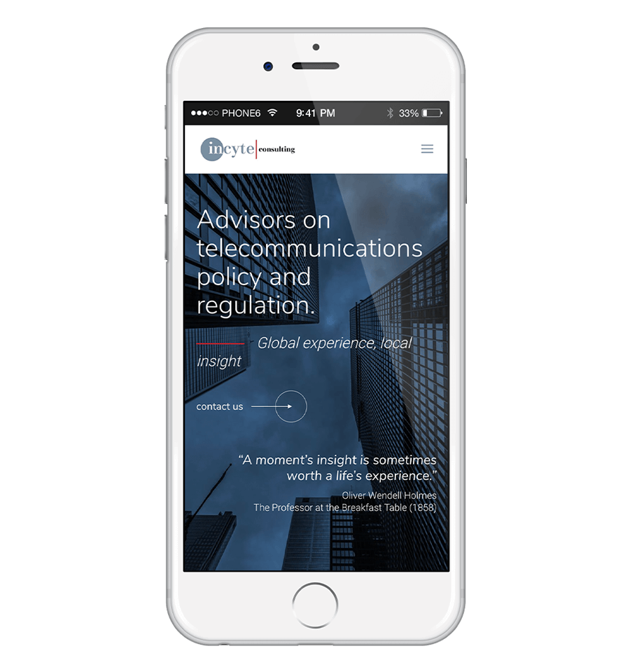
We selected branding colours and fonts and than got into designing the logo. The company already had a logo, but it needed to be updated. The new logo desing resembles the original design just enough so all customers will still recognise it, but looks modern and much cleaner.
When designing the layout and functionality for this site – I wanted the site to be modern, elegant with all information to be easy accessible and found on the site by any user on any device.
The layout of the site is not what considered “standard”, with lots of sectons are not centered, but still balanced when lookig at the page. The buttons design is also different, we used this design only on this site. We used branding colours throughout the website layout, using red ocassionaly on little details to add contrasting colour, but the main colour on the site are a few different shades of grey.
![]() visit site
visit site
Branding Colours
We designed the company logo first and then used branidng branding colours throuhgout the website, co bring all brand elements together in a flowing, recognizible brand design.

#788fa0


Typography
Font family used for headings: Playflare Display (Google font)
Family font used for body text: Nunito Sans (Google font)
Lorem Ipsum
Cras mattis consectetur purus sit amet fermentum. Donec id elit non mi porta gravida at eget metus. Vestibulum id ligula porta felis euismod semper. Donec sed odio dui.
Seamlessly responsive design
With more users using their mobile phone to brows online, we concentrated during the development that the site works seamlessly across mobile, tablet, and desktop devices.


![]() let’s work together
let’s work together